
Ch 8. CSS 속성- Flex(정렬)
플렉스(정렬) Container
수평 정렬된 1차원 레이아웃을 만든다.
1
2
3
4
5
6
7
8
9
10
11
12
13
14
15
16
17
18
19
20
21
22
23
24
25
.container {
  background-color: royalblue;
  **/* display: flex; */**
}

.container .item {
  border: 4px dashed red;
  background-color: orange;
  width: 100px;
  height: 100px;

}

.container .item:nth-child(1) {
  position: relative;
}

.container .item:nth-child(2) {
  top: 50px;
  left: 50px;
}

.container .item:nth-child(3) {

}

flex 적용 전

flex 적용 후

dispaly : Flex Container의 화면 출력 특성
- flex: 블럭 요소와 같이 Flex Container 정의
- inline-flex: 인라인 요소아 같이 Flex Container 정의


flex-direction: 주 축을 설정(수평 정렬할거냐 수직 정렬할거냐)
- row: 행 축 (좌 ⇒ 우)
- row-reverse: 행 축 (우 ⇒ 좌)
- block 요소는 어치파 수직으로 쌓여서 열 축 속성(column, column-reverse)을 잘 사용하진 않는다.


flex-wrap: Flex items 묶음(줄바꿈) 여부
- nowrap: 줄바꿈 없음
- wrap: 여러 줄로 묶음
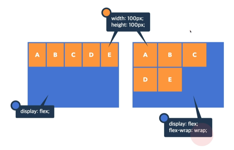
nowrap: 줄 바꿈이 없기 때문에 한 줄에 요소들을 다 끼워 넣는다.
wrap: 줄 바꿈이 있기 때문에 요소의 크기를 유지한다.
justify-content: 주 축의 정렬 방법 (수평 정렬)
- flex-start: 아이템들을 시작점으로 정렬
- flex-end: 아이템들을 끝점으로 정렬
- center: 아이템들을 가운데 정렬
- space-between: 아이템 사이를 균등하게 정렬
- space-around: 아이템들의 외부 여백을 균등하게 정렬

align-content: 교차축의 여러 줄 정렬방법 (수직 정렬)
아이템들이 두 줄 이상이여야 한다
- strech: 아이템들을 시작점으로 정렬 (기본값)
- flex-start: 아이템들을 시작점으로 정렬
- flex-end: 아이템들을 끝점으로 정렬
- center: 아이템들을 가운데 정렬
- space-between: 아이템 사이를 균등하게 정렬
-
space-around: 아이템들의 외부 여백을 균등하게 정렬

strech, strech, flex-start

align-items: 교차축의 한 줄 정렬 방법
- strech: 아이템들을 시작점으로 정렬 (기본값)
- flex-start: 아이템들을 시작점으로 정렬
- flex-end: 아이템들을 끝점으로 정렬
- center: 아이템들을 가운데 정렬


Flex Item
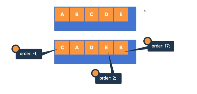
order: Flex Item의 순서
- 0: 순서 없음
- 숫자가 작을 수록 먼저
flex-grow: 아이템의 증가 너비 비율
- 0: 증가 비율 없음

1
2
3
4
5
6
7
8
9
10
11
12
13
14
15
16
17
18
19
20
21
.container {
  background-color: royalblue;
  height: 300px;
  width: 500px;
  display: flex;
  justify-content: center;
  align-items: center;
}

.item {
  background-color: orange;
  width: 100px;
  height: 100px;
  border: 3px dashed red;
  **flex-grow: 1;
  flex-basis: 0;**
}

.container .item:nth-child(3){
  **flex-grow: 2;**
}

증가 비율 없음

flex-grow 설정 (1:1:2)
flex-shrink: 아이템의 감소 너비 비율
- 1: flex container 너비에 따라 감소 비율 적용

flex-basis: 아이템의 공간 배분 전 기본 너비
- auto: 요소의 content 너비

flex-basis 적용 전

flex-basis 적용 후
